It is week Four of the One Room Challenge and my work is complete! Our panels, which turned out amazingly, were shipped to Dallas on Monday. Inspired by many color options, we settled on using several shades of pinks as the more prominent color which will add warmth and life to the foyer.

Over the past few weeks, I've documented some of my color mixing techniques used for this project commissioned by Jennifer at The Pink Pagoda. A few weeks ago, I did a post that referenced the colors which were used in our paintings. I would traditionally not use latex paint, but because we chose plywood panels as our canvas, we decided to try a few of the Pantone inspired colors via Valspar's Spring line. I was then able to incorporate my favorite pigments to create a variety of complimenting hues and shades playing off of the main colors.


Above are a few of my favorite paints that allow me to create a plethora of additional colors. The Derivan Matisse line is another favorite of mine when I am looking to create a more opaque layer. For acrylics, these and Golden paints tend to dry truer to color than thinner body paints which I usually only use as a base or undercoat. The Matisse line is available in several custom and muted colors, but I prefer a bit more control and adjust them by adding other pigments to create a color.
I've always been able to look at a color and create a match like a chef creates flavor. I think it's possibly my strongest asset as an artist. This skill comes very naturally to me. Being self taught, I'm sometimes embarrassed to admit I've never really studied the color wheel until more recently in my career. But, after doing so, it has allowed me to better understand the logistics behind my own personal techniques providing an easy quick reference if needed.

A good example of how my eye sees and mixes color, is the beautiful Stroheim velvet fabric sample Jennifer sent me. She recently had a settee lacquered and reupholstered with the blue velvet for her entry.

Another method I personally love to use, is creating a custom shade of gray for each specific painting that I'm working on. Grays seem to always "ground" bright or bold colors, and to me, add a beautiful soft transition into the neighboring color. I usually lean towards more moody or muted color palettes and though subtle, they add sophistication even to the primary color family.

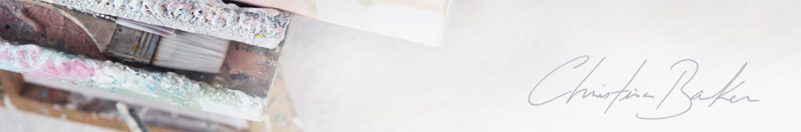
One of my favorite methods for creating a custom gray is mixing the two complimenting colors, or sometimes three, that are in the painting, along with white. The gray that is created turns out to be the perfect shade of gray specifically meant for that piece of work. Seen here, I am mixing pink, green, and white for a muted flesh tone with added blue for a warm gray that is perfect for the painting in production.

Now that our paintings are complete, let's head back over to The Pink Pagoda and see what she has been up to with her entry!


